Extending your theme with helper classes
Archived
6 Tasks
15 mins
Pega Platform 8.5
Beginner
User Experience
English
Scenario
The InsCorp design team has asked you to extend the GoGoRoad application theme and provided some updated designs for the tags landing page. During this challenge, you move through some of the questions that help define how this updated design is implemented in the COE layer and walk the user through the implementation steps.
The following table provides the credentials you need to complete the challenge.
| Role | User name | Password |
|---|---|---|
| Application Developer | author@gogoroad | pega123! |
Challenge Walkthrough
Detailed Tasks
1 Review the updated design with the UX designer
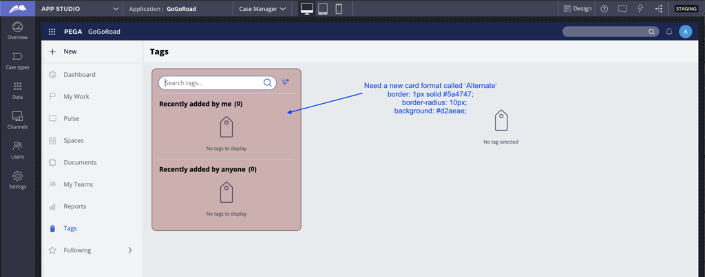
After meeting with the UX designer, the request is to update the tags landing page with a new card format called Alternate.
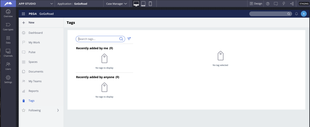
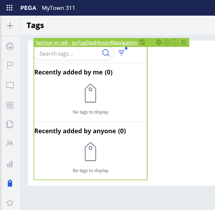
The landing page before the changes looks like the following image:
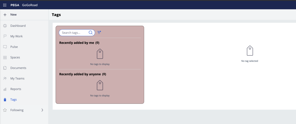
The UX designer is asking to update the UI to look like the following image:
During the review of the updated design, it is important to raise the following questions to the UX designer:
- What is the purpose of this new Alternate card format?
- Is there an existing format that may accomplish the same goal?
- Is there a plan to use this format in other places or is it specific to the tags landing page?
- Why is it named Alternate - Is there a better name for this format that would better reflect the use of this format through the application?
- Is the background color #D2AEAE used somewhere else in the application?
- What is the purpose of this color? Is there a semantically meaningful name for this color?
- Is it going to be used for other components or only for this card format?
- Does this color pass color accessibility contrast for AA or AAA?
- Same question for the border color
- Why use a border-radius for this format?
- The default card does not use a border radius. Is there a plan to use this radius for other components?
- Are we going to change the design systems to use more rounded corners?
- If a new mixin is created, should it inherit from an existing mixin?
This conversation provides an understanding as to how these changes are going to be implemented.
After this meeting, the following decisions are made:
- The name Alternate is not very meaningful and semantically understandable. The team decides that highlight might be a better name; this card format can be used to highlight some important information on the screen.
- A new mixin called Highlight will be created to set the border, background color, and other settings like padding and border-radius.
- Because the UX designer does not see another usage of this new card style in the rest of the application, a new helper class called layout-highlight will be created. This is a better choice than creating a new container format that might confuse other developers and increases the size of the CSS. If this card format starts to be more present in the application, the team might consider moving it to a container format.
- Some issues were found around color contrast accessibility and the UX designer will provide a new background color.
2 Add a new mixin to the skin
- Switch to Dev Studio and open the application skin called 'GoGoRoad', Configure -> Skin.
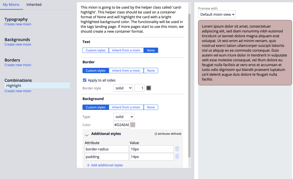
- Go to the Mixins tab and create a new Combinations mixin called 'Highlight'. Use the annotation field to provide more context on the mixin. This will help maintain this helper class as well as provide more details on how to use this mixin to the other developers working on the application.
Annotation :
"This mixin is going to be used by the helper class called 'layout-highlight'. This helper class should be used on a container format of 'None' and will highlight the card with a bright highlighted background color. The functionality will be used in the tags landing page. If more page starts using this mixin, we should create a new container format"
- Set all the settings according to the design document. We are going to use additional styles on the background to set the border-radius and the padding. The preview in the skin gives a good idea of what the new style will look like.
- Text: None
- border: 1px solid #5a4747
- border-radius: 10px
- padding: 14px
- background: #D2AEAE
3 Add a new helper class to the skin
The value of $mx-highlight-border is going to be the full border shorthand. It is also possible to retrieve the styles set as additional styles in the background category like padding and border-radius. Doing so avoid hardcoding presentational values into the CSS files and makes it easier to maintain these design tokens from the mixins.
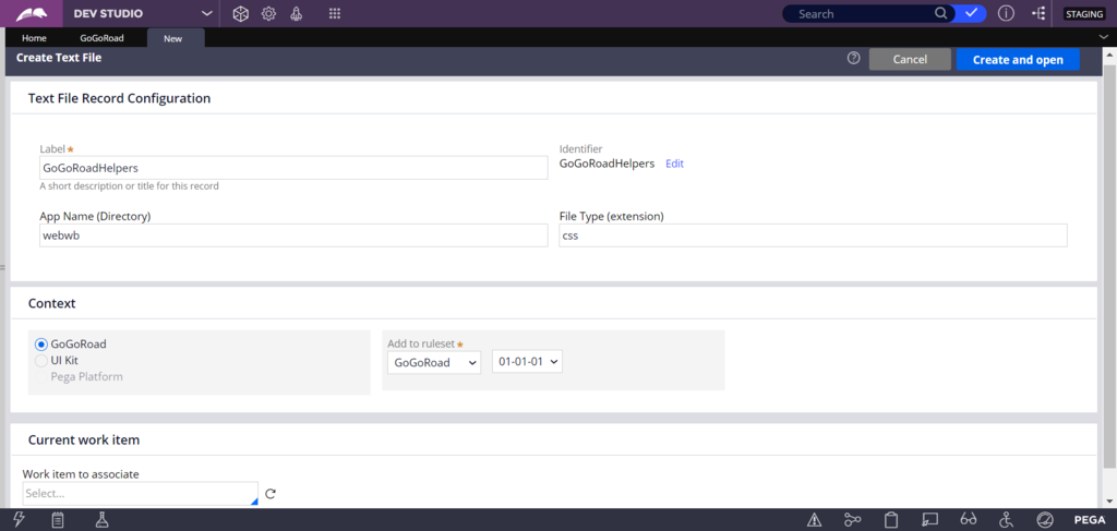
- In the GoGoRoad skin ruleform, go to the Included styles tab.
- Create a new additional stylesheet called GoGoRoadHelpers.
- Create the rule CSS file in unlocked ruleset GoGoRoad:01-01-01 and enter the following code:
/****************************************
Type: helper-class
Name: layout-highlight
Category: layout
Description: Use on a dynamic layout to make the card use the 'Highlight' mixin
*********************************************************/
.layout-highlight {
}
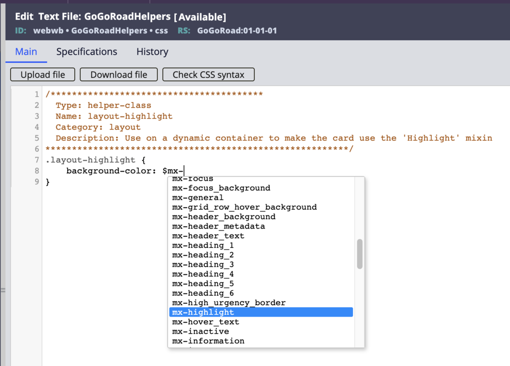
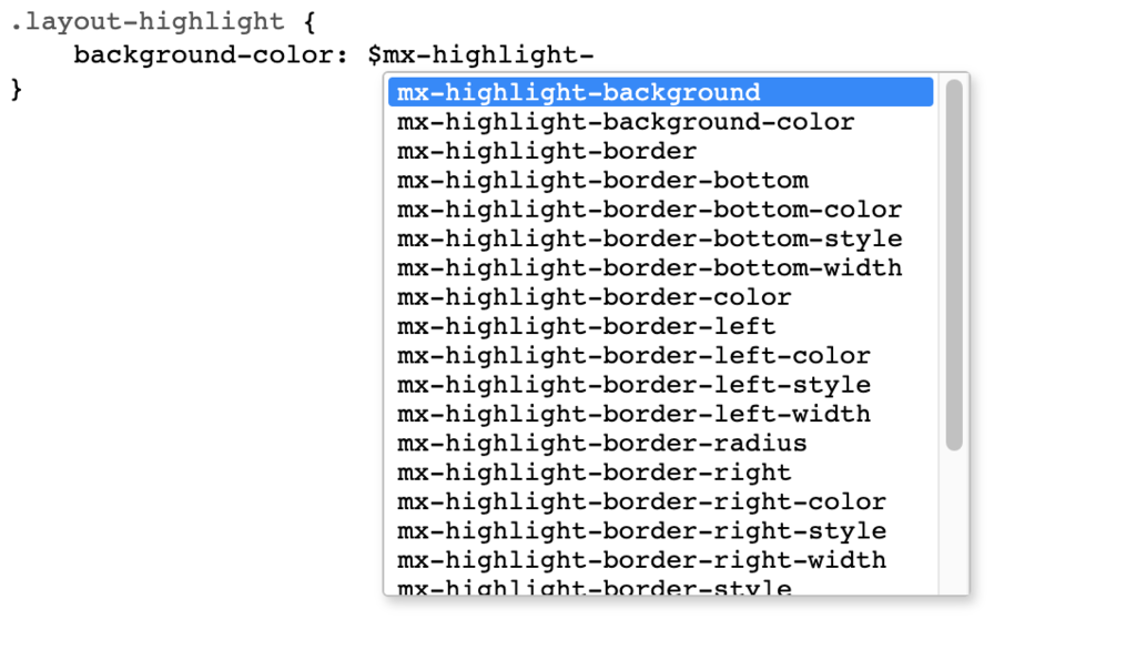
- Use the mixin-variable autocomplete to first confirm that the highlight mixin is available (by typing $mx- ) and then to identify the values that are available for the 'highlight' mixin using $mx-highlight-
- Enter the following CSS snippet in the text file:
/****************************************
Type: helper-class
Name: layout-highlight
Category: layout
Description: Use on a dynamic container to make the card use the 'Highlight' mixin
*********************************************************/
.layout-highlight {
background-color: $mx-highlight-background-color;
border: $mx-highlight-border;
border-radius: $mx-highlight-border-radius;
padding: $mx-highlight-padding;
} - Click Save.
- Return to skin rule GoGoRoad and save it.
4 Verify the values of the new helper class
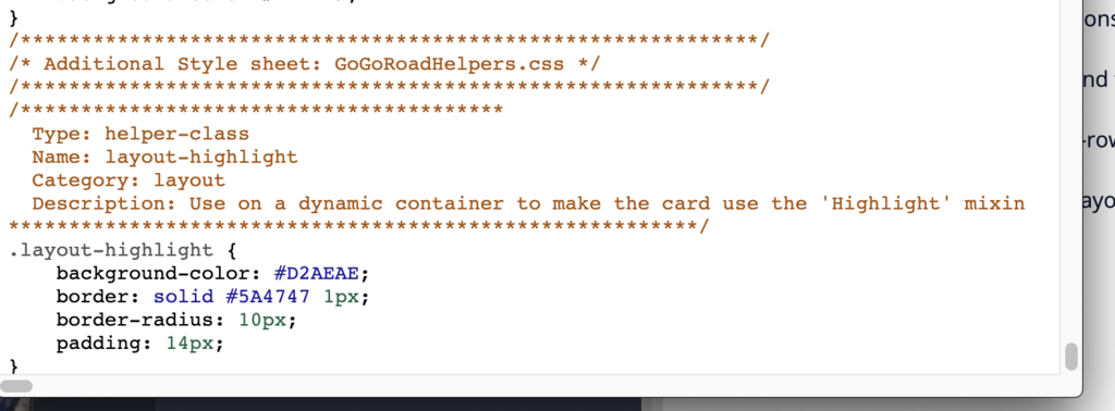
- In the GoGoRoad skin rule, click Actions > Preview to get the auto-generated CSS content.
- Scroll to the bottom of the file to find the new helper class that was added and confirm that the correct values are set.
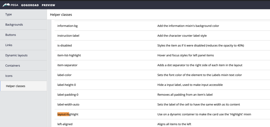
- In the GoGoRoad skin rule, go to Actions > Launch > Skin preview to get a style guide of your skin.
- Click Helper classes and search for the layout-highlight helper class to confirm it is present.
5 Use the helper class in the tags landing page
- Open the Case Manager portal as a secondary portal, and go to the Tags landing page.
- Click the Toggle runtime toolbar icon, and then click the Toggle Live UI icon to open the section pyTagDashboardNavigation.
- Open the section in Dev Studio and do a Private Edit of the section.
- Open the Property panel of the top-level Dynamic Layout (Stacked) – 1.
- Set the Container format to None (instead of Default).
- In the Presentation tab, make sure to make the layout as Optimized.
- Select the Display advanced presentation options check box to view the helper class field called content CSS class.
- Open the helper class picker.
- Search for layout-highlight and check that the description matches what was added to the CSS file.
- Add the class to the field.
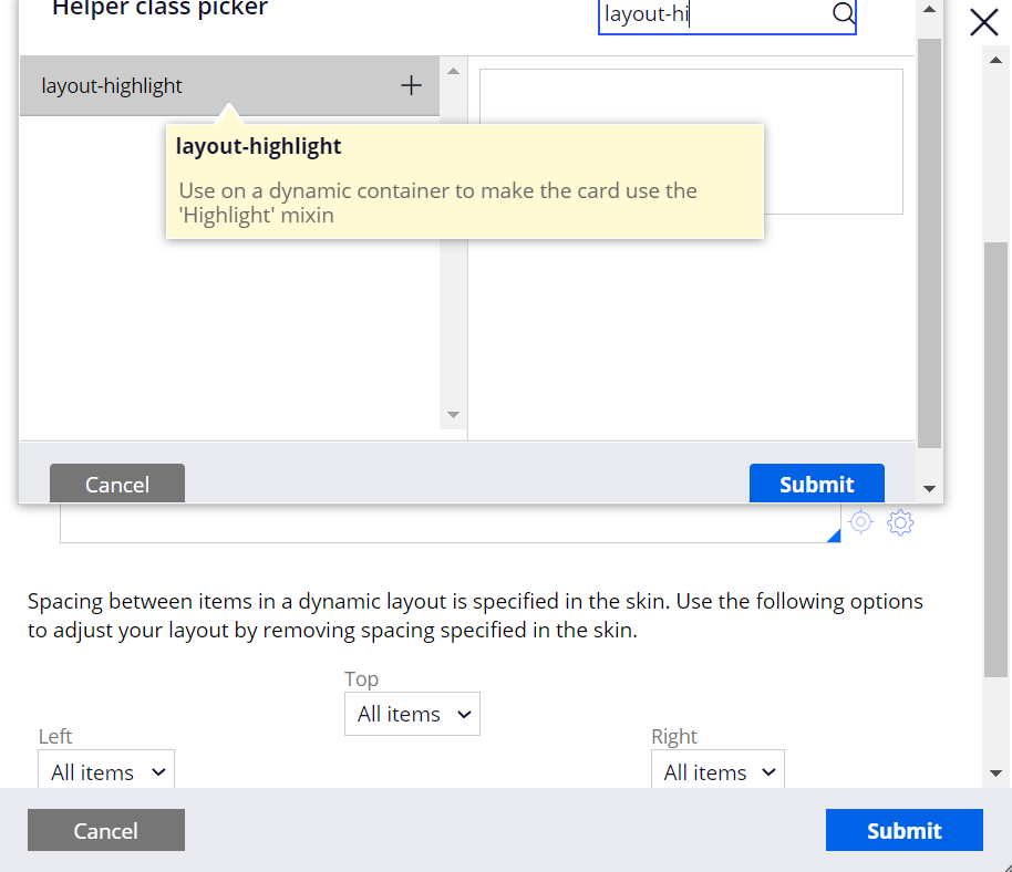
- Click Submit.
- Save the rule with these changes.
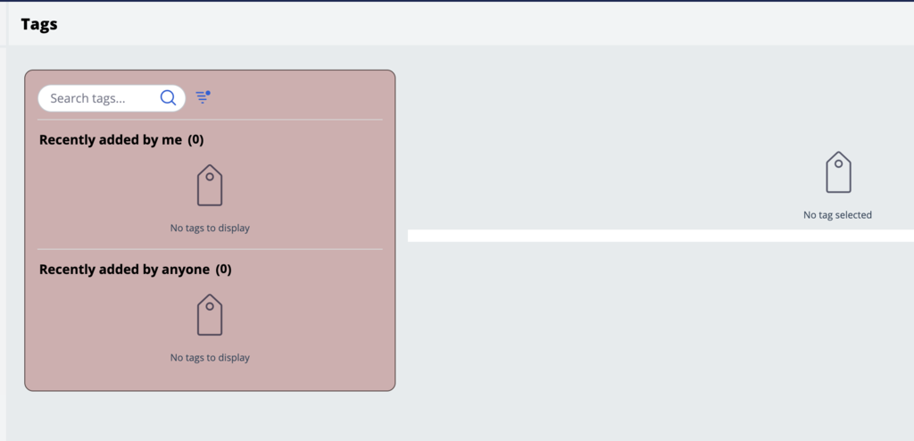
- Go back to the Case Manager portal, refresh the browser, and review the changes made on the Tags page.
6 Improve the implementation
Remove the default container around the parent dynamic layout to get closer to the design.
- Click the Toggle runtime toolbar icon, and then click the Toggle Live UI icon to open the section pyTagDashboard.
- Open in Dev Studio and perform a Private Edit of the section.
- Open the Property Panel for the top-level Dynamic Layout (Inline grid 30 70) – 1.
- Change the container format to None.
- Convert the dynamic layout to use Optimized.
- Add the helper class padding-2x to the existing classes height-100-pct.
Note: As you can see from the screen shot above, there is still a white background coming from the layout group default format. To remove it, you need to add a new helper class that sets the background to None for the content of the layout group. Try to apply some of the approaches learned during this mission and try to address this UI issue.