Case detail configuration in the summary panel
The summary pane contains the case details section that help the end users quickly view and understand the most critical case data. Because the viewable data varies by case type, designers and product managers define what data belongs in the case details area.
The case details section is based on a Cosmos design template and as a result, App Studio can be used to map case properties or section rules to specific regions of the case details section. The underlying Pega Cosmos design templates define the layout and styling for the regions so that perfect UI is achieved without the modification or maintenance of traditional section rules and dynamic layouts.
Note: Because the styling, layout, and regions are defined in underlying design templates and because developers simply map fields into regions instead of forking and maintaining traditional section rules, upgrades to future versions of Theme Cosmos require significantly less work.
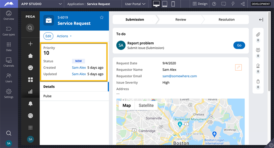
Before configuration, the case details section of the summary pane renders some of the basic data that all cases contain, such as Priority, Status, and the user who Created and Updated the case. However, you can control the visibility of the default and custom fields in the case details section.
Case details regions
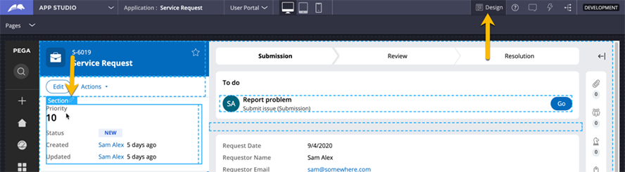
App Studio is used to configure the data shown in the case details section. While viewing a case, you can enable Design mode, and edit the case details section.
Tip: To edit the section, hover over the case details section, and then click the Edit icon.
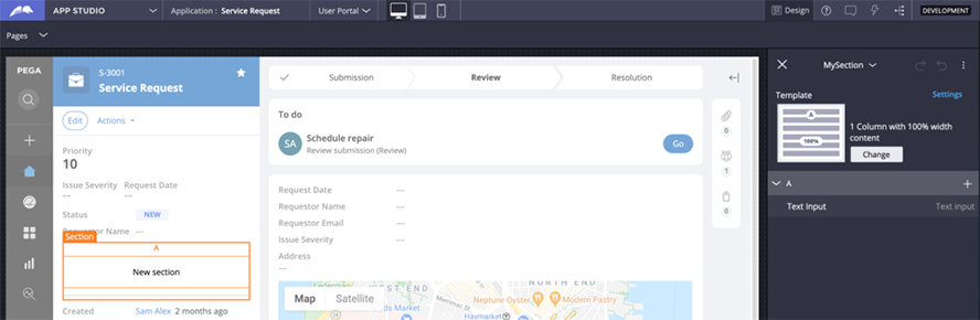
Mapping fields into Case Details regions
Developers use the contextual pane on the right to map case data to three regions.
- The Additional critical data region renders fields inline and displays only a few properties that are the most critical for understanding the case at a glance.
- The Primary case data and Additional details regions render fields vertically and display other primary and additional case data.
Note: When developers use App Studio to modify the Case Details area, the system performs a Save-As of the Work- version of the CaseDetails section rule into your application rulesets, specialized by the case class. Because the section rule uses a Cosmos design template, the specialization of this rule only persists the mapping of fields into regions. If a future version of Cosmos improves the underlying design template, for instance, styling updates, then the improvements are automatically implemented without removing the override on the rule to implement the latest improvements.
At the top of each region header, click the Plus icon to select and map a field or section to that region. For example, in the following image, Issue Severity and Request Date are mapped to the region. Requestor name, which is important but less critical, is mapped to the Primary case data region.
When you finish adding the fields in each region, exit design mode by using the Design icon again. Your changes are persisted to the application rulesets in a CaseDetails section rule, specialized by the class of the case type.
In the center of the following image, slide the vertical line to learn about configuring the case details section.
Mapping section rules to case details regions
Instead of mapping the same individual fields across multiple case types, a developer may decide to build a common section that can be shared across case types, then map the section to a particular region.
Tip: The section you plan to map into a region must be based on a design template. Be aware of double spacing and padding in the final UI that often occurs when sections are nested. For more information about fixing spacing issues, see the Pega Academy mission Infinity Front-End Foundation.
To add a section to a case details region, in the design mode contextual pane on the right, collapse the menu and expand the menu. Sections that are marked as relevant records are available to add to the case details. Developers can also use the Plus icon in the Sections header to create a new section rule.
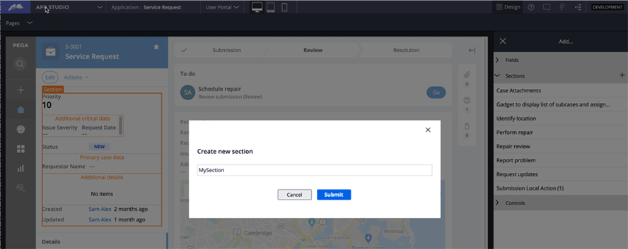
The new section, with placeholder text New section, is added to the Additional critical data, Primary case data, or Additional details region.
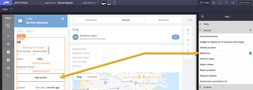
After creating a new section, you can edit the section settings.
Tip: To edit the section, hover over the section, and then click the Edit icon.
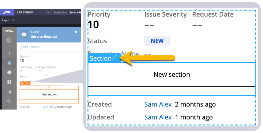
By default, a new section is based on the 1 Column with 100% width content design template. Developers can remove the default Text input control (named New section by default) or map to the desired fields.
Visibility of default fields in Case Details
An underlying design template drives the case details section of the summary panel. The Case details UI template exposes regions to which a developer can map fields or other sections. To prevent developers from repeatedly mapping the same common fields in every case type, the underlying design template automatically renders specific fields. The fields include Priority, Status, Created By, Updated By, and Resolved By.
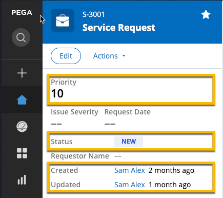
Because not all case types need to display these fields, you can use App Studio to control the visibility of each case type. In the contextual pane used for mapping fields to the case details regions, use the option to control the Priority ( check box) and Status ( check box) visibility. The Hide default case data check box toggles the visibility of three fields: Created by, Updated by, and Resolved by. As you toggle the fields and apply your changes, the case details section updates immediately.
In the center of the following image, slide the vertical line to learn about configuring the visibility controls.
Check your knowledge with the following interaction.
If you are having problems with your training, please review the Pega Academy Support FAQs.
Want to help us improve this content?