Controls and presentation
User interface elements (such as text inputs and layouts) present information and actionable items on the user interface.
User interface elements in Pega Platform
In the Constellation architecture, the system pairs the field automatically with the optimal out-of-the-box control. The UI elements of Pega Platform™ include basic controls that you can use out of the box, including:
- Autocomplete controls
- Check boxes
- Drop-down lists
- Links
- Rich-text editors
- Text input
Note: For more information about the Field Types available, see Configuring fields.
Styling user interface elements
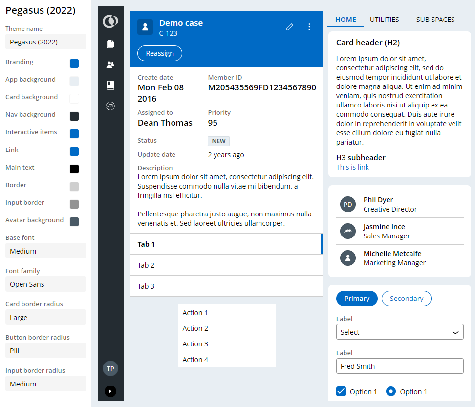
In the Constellation Architecture, you can use themes to configure the styling of UI elements such as buttons, links, or headers. Changes to a theme affect all UI elements across the application. Establishing a consistent look for UI elements in your application saves development time, gives your application a more predictable user interface, and makes it easier for users to complete forms.
The out-of-the-box Pegasus theme is displayed in the figure below:
Note: To learn more about styling an application, see Defining themes.
Check your knowledge with the following interaction:
This Topic is available in the following Module:
If you are having problems with your training, please review the Pega Academy Support FAQs.
Want to help us improve this content?