
Form Views
Form Views are reusable interface designs for collecting data from users and processing work. You can help users complete their work efficiently by designing intuitive form Views. For example, in a loan application, you can create a View with fields for collecting data about a secondary applicant and, when needed, reuse that View in different contexts throughout the application.
Form View creation
You can configure form Views automatically when designing a workflow or from a Case Type or Data Object.
When you add a Step in the Case Lifecycle, the system automatically creates a form View.
Form View design options
When you design a form View, you can select from layout and instruction options.
Note: For more information about form authoring best practices, see Text guidelines for form authoring.
Template
By default, form Views use the Default form template option. To use a different template, create a different View type. The following table describes the different View types and template options:
| View type | Template |
|---|---|
| Form | Default form |
| List | Table |
| Partial | Details (One column) |
| Details (Two column) | |
| Details (Three column) | |
| Details (Sub tabs) | |
| Details (Narrow-wide) | |
| Details (Wide-narrow) | |
| Dynamic tabs (list) |
Note: All fields in partial Views are read-only.
Layout
When you use a form layout, you set the number of columns that the form must contain. Forms can use one to three columns, but as a best practice, use a two-column layout for most use cases.
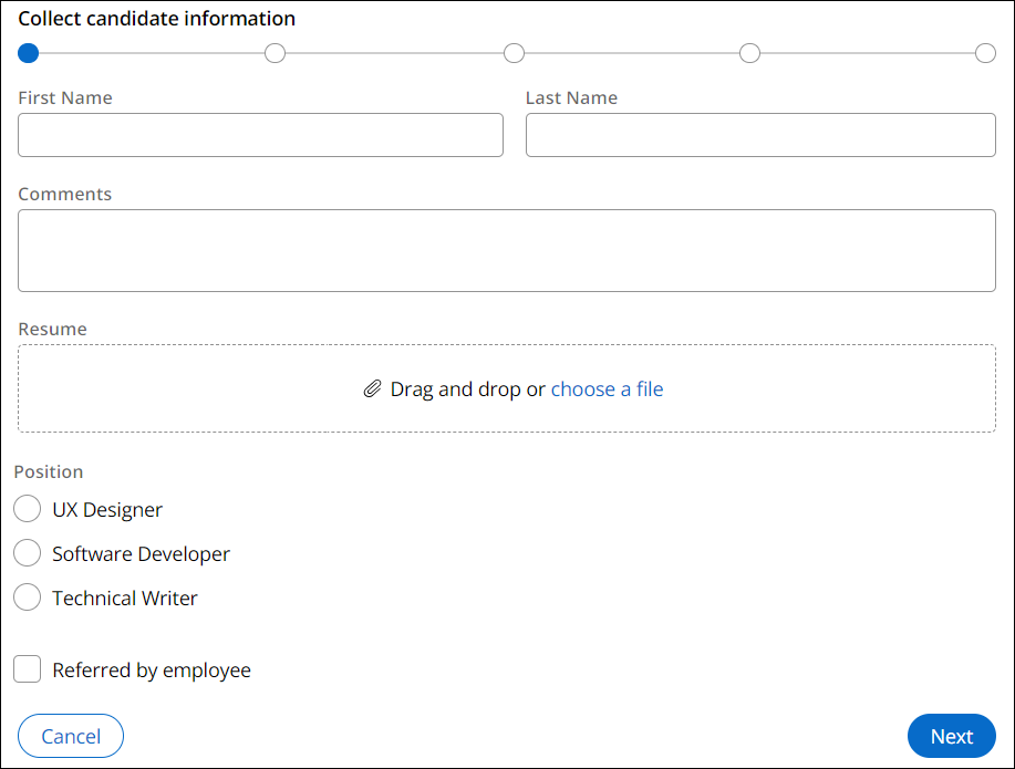
The fields that you include in the form auto-adjust their size and width depending on prescribed design standards. For example, in a two-column form template, inputs such as Text (single line) and Currency take up only one column. Wider inputs, or inputs that can be any height, such as a Rich Text Editor, Text area, Radio group, Checkbox, Booleans, and Attachments, span two columns. This adjustment increases usability and ensures that tabbing takes users from left to right, instead of top to bottom.
The following figure shows a default form template that adjusts layout based on input type:
Instructions
By default, a form View displays the Step instructions that you added when designing the workflow details. When refining a form View in Pega Platform, you have the option to override Case Step instructions with custom text or to hide Step instructions.
Multi-step Forms
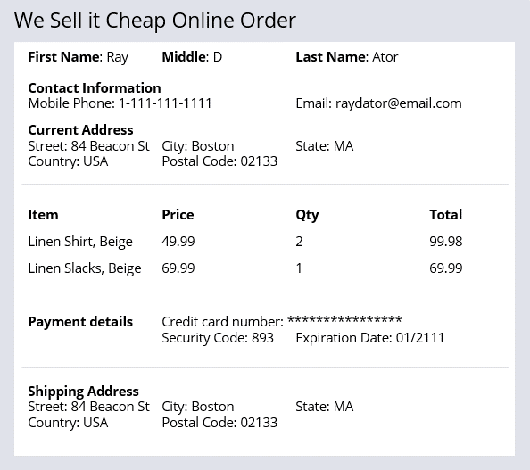
Long, complex online forms can make navigation difficult for users. For example, online order forms require a lot of data. The following image shows a single form where users must enter contact information, the items to buy, and the payment method:
A Multi-step Form represents a single Assignment completed by a single user that is composed of multiple focused and concise Views. It is a guided, linear workflow using related UI screens.
Note: The default Create Process in the Create Stage is a Multi-step Form. Like a Step, a Multi-step Form is added to the Case Lifecycle.
You can use a Multi-step Form to help users complete complicated tasks. For example, instead of having a single, confusing online order form, configure a Multi-step Form. The Multi-step Form presents information from the online order form in a series of simple, easy-to-navigate screens.
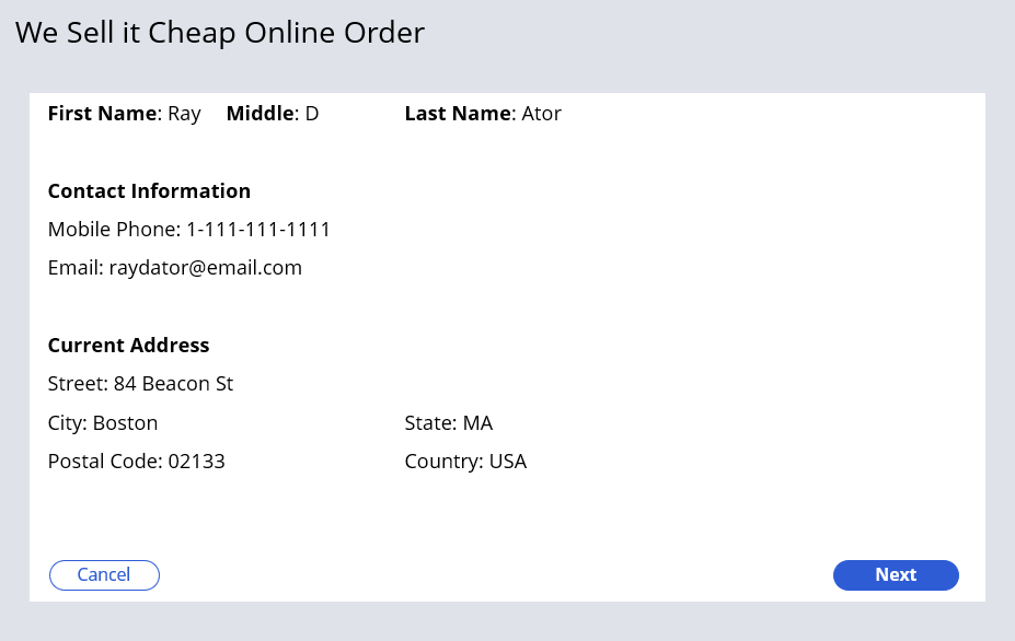
Multi-step Forms provide three navigation styles: horizontal, vertical, and standard navigation. With all three styles, users navigate through the screens using Next and Previous buttons. The following figure displays an online order Multi-step Form that uses standard navigation:
With horizontal and vertical navigation, a navigation menu (oriented horizontally or vertically) displays which Step within the Multi-step Form that the user is on. The following figure displays an online order Multi-step Form that uses vertical navigation:
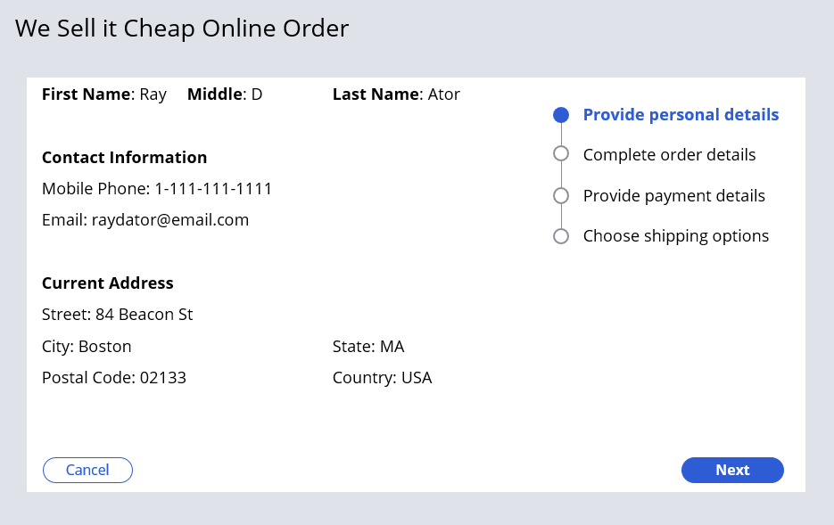
Although Multi-step Forms are recommended when the information must be filled out in sequential order, users can navigate between the Step as long as there are no required fields and the Multi-step Form is not submitted. Step navigation in Multi-Step Forms allows a user to navigate freely between form steps. A user has the ability to jump to any step directly from the progress indicator in both vertical and horizontal navigation, instead of moving strictly forward and backward. This allows a single user to review or update previously entered information, making long multi-step forms easier to work with and improving the usability for data-heavy screenflows by supporting non-linear navigation.
You can display step labels in the horizontal progress indicator, improving readability and orientation as users navigate through steps. When steps labels are displayed, the system adjusts the layout responsively to handle longer or additional step labels while maintaining compatibility with existing form behavior.
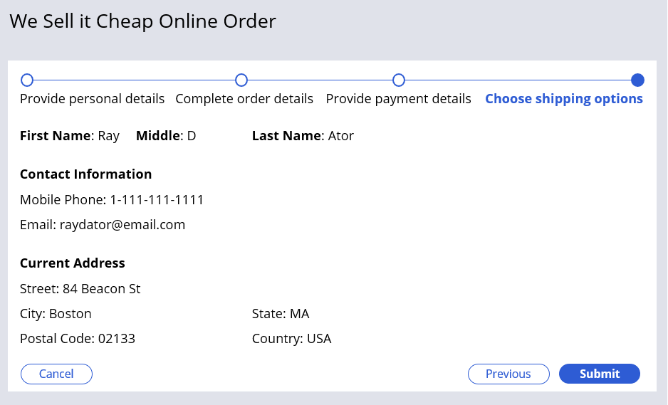
The Submit option is available on the last screen of the Multi-step Form. The following figure displays the last Step of an online order Multi-step Form that uses horizontal navigation:
Hierarchical forms
Like Multi-step Forms, hierarchical forms divide a complex Assignment that captures data across many fields into smaller, related groups of fields. Hierarchical forms reduce scrolling and optimize the window area for users during Case processing.
Where a Multi-step Form is created from the Case Lifecycle to divide the information across multiple form Views, a hierarchical form is a template applied to an existing assignment that splits the information across multiple tabs in a single form View. Each tab is referred to as a form group. Each form group in a hierarchical form is not an independent View and it is not reusable or accessible through a Views list.
As a best practice, Multi-step Forms are recommended when users must fill out the form sequentially since the user interface patterns indicate linear progression. Hierarchical forms do not include the Next and Previous buttons by default and are recommended when users can fill out the information in any order.
Note: As a best practice, hierarchical forms should not be used in a Multi-step Form as this implementation may confuse users about the Next button navigation.
Check your knowledge with the following interaction:
This Topic is available in the following Module:
If you are having problems with your training, please review the Pega Academy Support FAQs.
Want to help us improve this content?