Responsive UI and tabular data
Responsive design with tables
In Pega Platform™, tables automatically display data from data relationships. To limit the information that is displayed when the display size changes, you can configure tables to adjust to that size. Responsive table design minimizes horizontal scrolling by removing the less important information from the user interface.
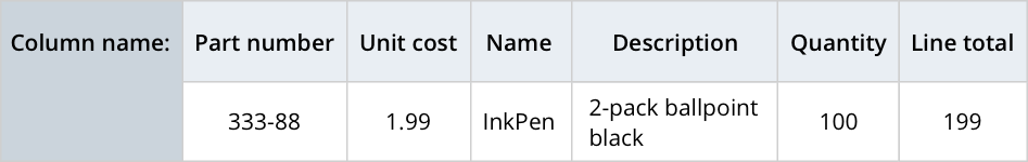
When you design responsive behavior, ensure that the displayed information aligns with the business needs. The order of showing information to users affects the user experience. For example, in the following table, the column and column should always be displayed, and the column should always be presented at the end of the displayed information.
Column importance
A table has one or more columns, each with a configured importance setting. Column importance defines how Pega Platform shows columns as the display size changes. The column importance options are Primary, Secondary, and Other; by default, the leftmost column is set to Primary.
In the following image, click the + icons to learn more about column importance.
You configure column importance in Dev Studio. Additionally, in App Studio, you can set or change a column to primary importance while editing the form configuration at run time. You can set column importance to primary by moving that column to the leftmost place in the table. When you change the order of columns in a table, Pega Platform automatically sets the leftmost column to primary importance and the remaining columns to secondary importance.
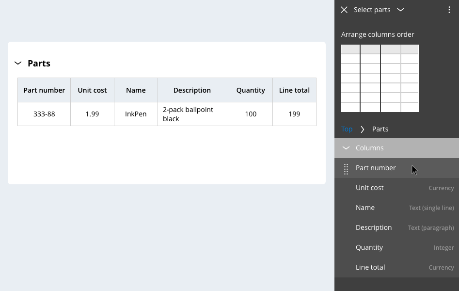
In Dev Studio, you can assign columns with primary, secondary, or other importance, and edit the column width. As a best practice, do not use fixed widths. For table-style layouts such as grids or tree grids, always set the width to 100%. This setting configures the display to adapt to the device that the viewer uses.
Note: To learn more about editing column properties in Dev Studio, see Arranging column visibility by importance.
Responsive table default breakpoint settings
By default, tables have two responsive breakpoints. At the first, wider breakpoint, columns with importance set to Other are not displayed. At the second, narrower breakpoint, the table is displayed as a list. For each row in the table, the contents of each column stack vertically, which eliminates the need for horizontal scrolling.
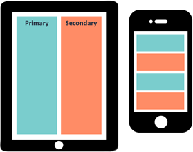
In the following table, click the + icons on each importance setting to learn more about how columns with different importance settings are displayed on each device type.
Check your knowledge with the following interaction.
If you are having problems with your training, please review the Pega Academy Support FAQs.
Want to help us improve this content?