Mobile design best practices
Mobile app design
Designing a Pega Platform™ application for mobile users requires you to recognize the specific capabilities and limitations of mobile devices. There are two categories of mobile-specific design considerations: design for offline use, and design for the characteristics of the device itself.
| Design consideration | Use case |
|---|---|
| Offline use | A mortgage underwriter frequently visits offices in the locations where the mortgage company does business. While traveling on a plane, the mortgage underwriter reviews loan requests. The mortgage app must be available when the mobile device is in airplane mode. |
| Device characteristics |
In a course selection desktop application, a hover action displays more information when a pointer hovers over a course name. The same hover action is useless on a mobile app because mobile devices do not support hover events. |
It is a best practice to minimize the need to customize an application for each delivery method. For example, instead of customizing an application to provide a mobile phone user experience that is different than the experience on a tablet, design an application that is compatible across device types.
Design to support offline use
The connection between an app and server may break if the device moves out of a coverage zone or wireless network range. If app users need access to the app at all times regardless of server access, design the app for offline use. When designing an app to support offline use, minimize server access in the UI design. Follow these best practices for offline mobile use.
| Best practice | Description |
|---|---|
| Enable client-side decisions and validations | Client-side decisions and validations occur on the mobile device, rather that the server. When a mobile application is in offline mode, the user can complete and submit a form. When the mobile device is online, the submission is passed to the server and processed. |
| Use data pages as data sources |
Always use data pages as a data source if you are designing applications to work on a mobile device when the device is not connected to a network. When a mobile application is in offline mode, the data pages store all completed work. The data pages sync to your application server when the mobile device is online. |
|
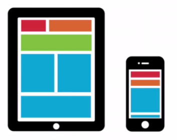
Use layout groups to take advantage of responsive UI |
Depending on the screen size, consider displaying content by using layouts such as tabs, accordions, or stacked layouts. Using responsive UI, layout groups automatically switch to a specific layout based on the resolution size. For example, the layout changes from a two-column layout to a one-column layout when you change a display from a tablet to a smartphone. The one-column layout has better readability and usability on smaller screens.
|
Design to device characteristics
In the following image, click the + icons to learn about the best practices to follow when building mobile-ready applications.
If you are having problems with your training, please review the Pega Academy Support FAQs.
Want to help us improve this content?