OOTB design templates
All out-of-the-box design templates follow specific naming conventions to convey their purpose and usage easily.
These design templates belong to different categories:
- Layout: Generic column layout templates
- Page: Used to organize sections on a page
- Header: Used to arrange metadata for the current item in the form of a page or section header
- Card: Used to arrange data for a single atomic item
- List item: Used to arrange data for items in a repeating list
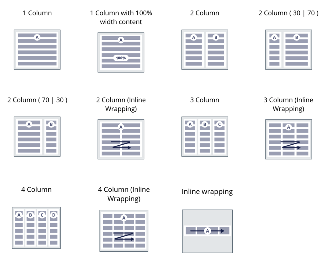
Layout templates
The following templates that provide generic layout functionality are available by default:
- 1, 2, 3, and 4 Column
- 1, 2, 3, and 4 Column with Inline wrapping
- Inline wrapping
- 1 column with 100% width content
There are also CSS helper classes available to achieve layouts with more than four columns:
- flex-col-5
- flex-col-6
- flex-col-8
- flex-col-12
Note: The 1 Column design template is the default template when creating any section or view; it is the recommended template for form fields that are stacked. To avoid rendering very long input fields that stretch to the full width of the container, the 1 Column design template uses a helper class called content-items-maxwidth on the dynamic layout. The helper class sets the maximum width of all the fields to 640px. If you want to use the full width, you need to use the 1 column with 100% width content template.
Page template
Page layout is very useful to define how the different widgets and utilities will be aligned on a page.
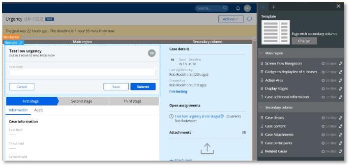
If your application is based on UI-Kit, the main page template for a case type is called Page with secondary column.
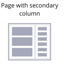
The template contains two regions for the main area and the secondary column where the utilities are as shown:
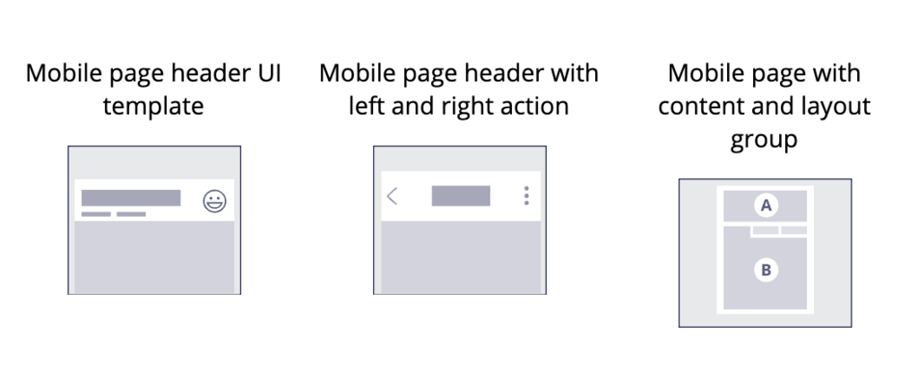
There are also three mobile page templates that provide specific functionality to keep the header sticky on scroll, as well as support for a back button in the header to navigate to the previous page.
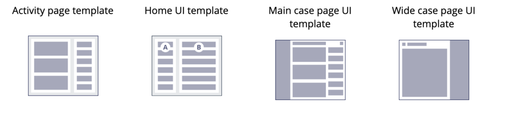
If your application is based on Theme-Cosmos, the four following page templates are available.
Note: The case page design templates are only available at Work- level and will only apply to case types. As such, it is possible to filter and limit the usage of some design templates to a certain class and functionality.
Header templates
A page is usually composed of two regions:
- Header
- Main content
It is important for the header of the page to use the <h1> tag for accessibility and is consistent throughout the application.
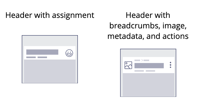
The following header templates are available for UI-Kit based applications.
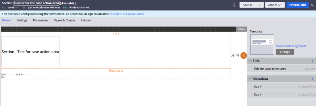
The following image is the section used in UI-Kit to render the assignment header for a case. The design template already includes the assigned operator icon.
The following image shows how this section is rendered at runtime.

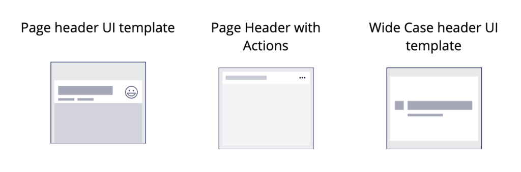
In Theme-Cosmos, the following header templates are available.
Card templates
The following templates are available for cards:
- Card with image
- Card for empty state
- Card with image and metadata
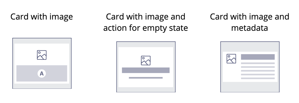
The following image shows how these templates look at runtime.
List items templates
The following templates are available for list items:
- List item with breadcrumbs, image, metadata, and actions
- List item with image and status
- List item with image, metadata, and actions
- List item with title, primary, and secondary data
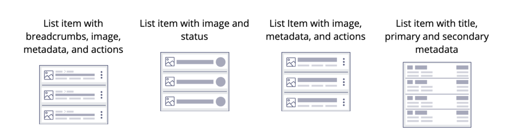
The following image shows an example that uses these design templates at runtime.
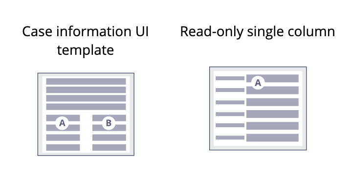
Case Details template
The case details are the set of information about a case.
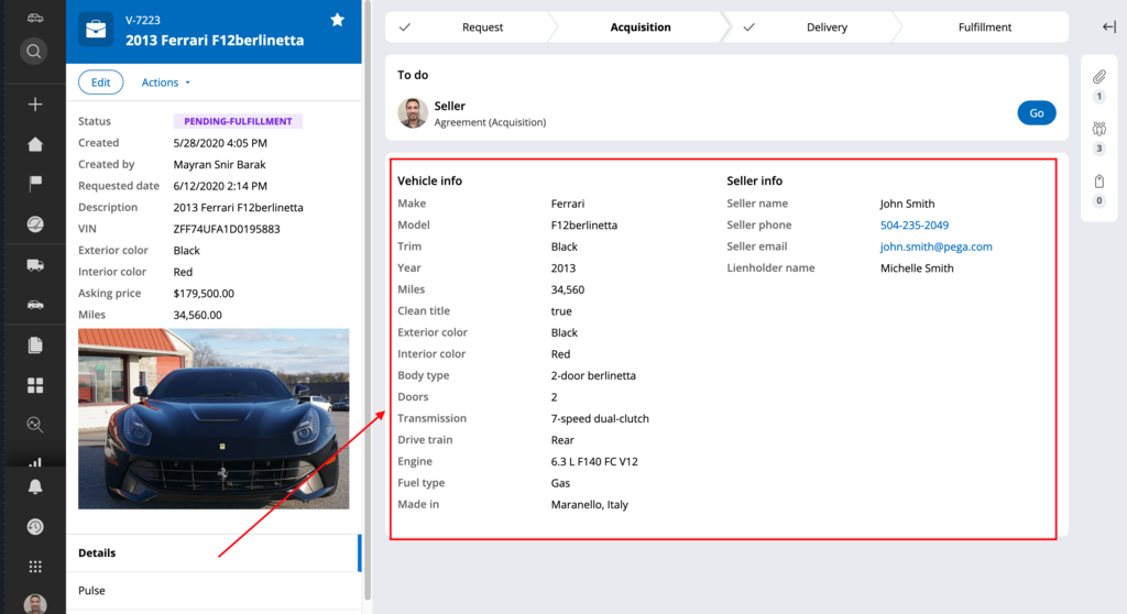
To render these details, two templates are used:
- The Case information UI template is used to create three regions, one region at the top that extends to 100% width for critical regions and two other regions side by side (A and B).
- The Read-only single column template uses a stacked with label left dynamic layout format and renders the properties of a case as a set of field values stacked with each label on the left of the value.
Check your knowledge with the following interaction.
If you are having problems with your training, please review the Pega Academy Support FAQs.
Want to help us improve this content?