Responsive user interface
Responsive behavior
Responsive behavior provides an optimal user experience of the elements in a view regardless of screen size — minimizing horizontal scrolling and maximizing data presentation in the available display space.
For an introduction to responsive user interface(UI), view the following video:
Video transcript
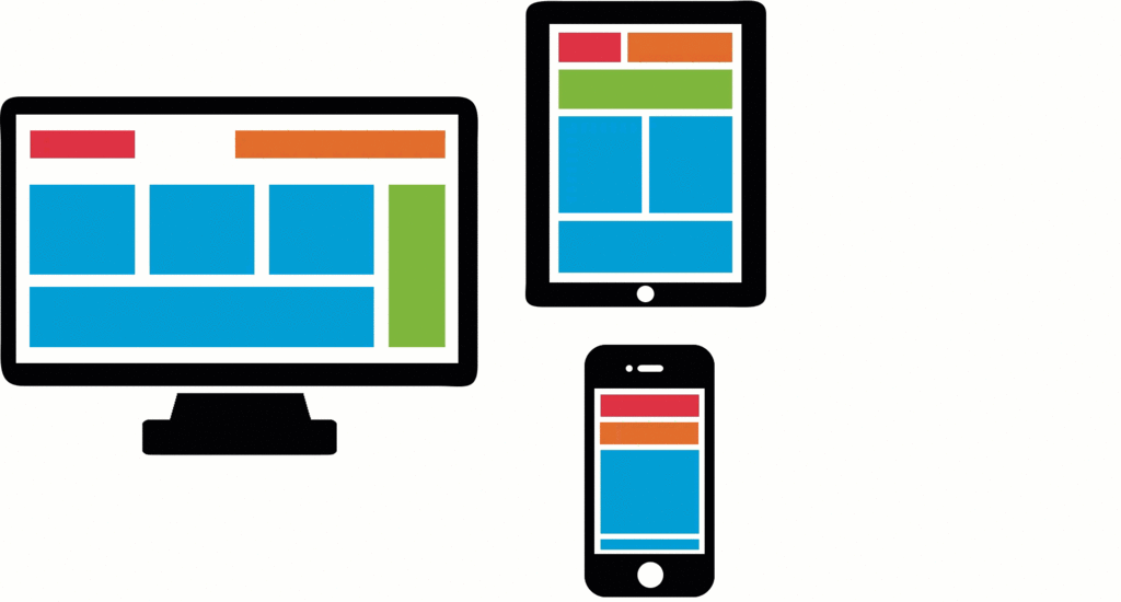
Every business strives to reach their customer regardless of the channel, location, or device. With such diverse screen resolutions and sizes, a responsive UI can automatically adapt to create an optimal user experience regardless of the device. Not only does a responsive UI benefit the end user, it also benefits the business, since one version of the UI can service multiple devices.
For example, after a minor car accident, the insured initiates a claim from home using their laptop. The UI is tailored to their high screen resolution. In another example, the insured wants to submit the claim immediately from their mobile device. The same process is presented to the customer with the UI adapting to their mobile screen resolution, giving them an equally productive user experience.
Responsive behavior options
Responsive behavior options include the design layout of the form and the column importance in tables. For example, when a user switches from landscape to portrait on a tablet, the UI responds and the screen dynamically becomes narrower.
Tip: Advanced customizations to responsive behavior, such as configuring custom breakpoints and modifying column importance, are performed in Dev Studio.
Responsive breakpoints
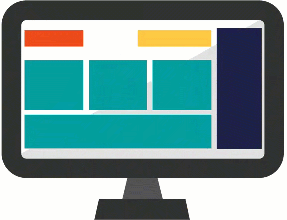
A breakpoint defines a display width. Pega responsive breakpoints are set automatically by default. When the display width crosses a breakpoint, the responsive behavior is applied to the layout. With a dynamic layout, responsive breakpoint behavior changes the layout of the fields based on the width of the display area.
For example, the default breakpoints automatically display four columns as two columns on a tablet, and as a single column on a mobile phone — making the form readable on smaller screen widths and eliminating the need for horizontal scrolling.
Breakpoint behaviors
You can select the behavior that you want to trigger with the breakpoint. Options for responsive breakpoint behaviors include:
| Behavior | Description |
|---|---|
| Hide this component | Hide the layout if the fields in the layout are not required, or are not considered core to the business process. |
| Transform to other format |
Transform the layout to another format. The available options vary based on the selected transform-to format. For example, it is possible to transform Two-Column and Three-Column layouts into a Single-Column layout, however, for a layout group, a menu might be transformed into an accordion layout. |
| Transform to list | Condense the table into a single column layout, where each row is shown vertically, prior to displaying the next row. |
| Drop columns with importance Other | Prioritize the columns in a table to ensure that the most important columns are always visible to users. When displaying the table on a smaller screen you may want to hide optional columns. Column importance defines how Pega Platform displays or hides columns (columns marked as Other are optional). |
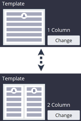
Layout templates
In App Studio, the layout of the fields is limited to the available design templates. The design template determines how the user interface changes. You can change the layout template by configuring the view at run time.
For example, you can configure a view to use a 2 Column design template instead of a 1 Column design template.
Preview for multiple devices
You can preview your application to see how it looks on various devices using the Preview feature. In App Studio, click Preview, and then select a portal from the portal list next to the application name. Hover over the monitor and tablet icons to check the preview size, and click on the icon to display the application preview for a device.

Check your knowledge with the following interaction.
If you are having problems with your training, please review the Pega Academy Support FAQs.
Want to help us improve this content?