Branding, theming, and styling in Cosmos React
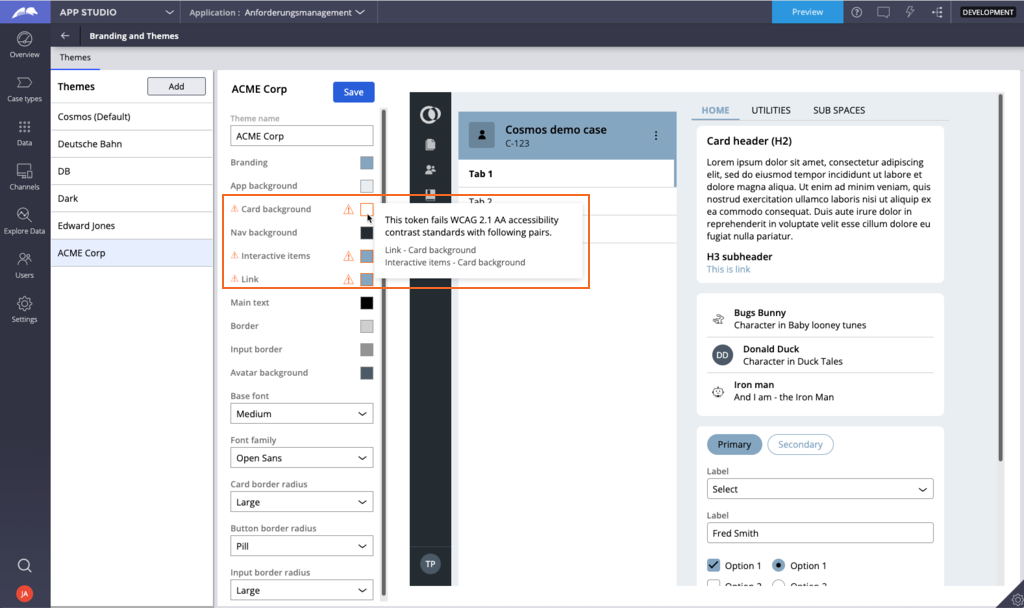
Following organizational branding and theming guidelines is important for many organizations. With App Studio, makers can easily apply colors, font styles, and other styling aspects of the Pega Cosmos design system to match organizational guidelines to support that adherence.
Accessibility is also essential for high-quality apps, and the Branding and Themes landing page in App Studio provides developers with the configurations that they need to achieve accessibility requirements by flagging color combinations that fail Web Content Accessibility Guidelines (WCAG) guidelines.
Note: For more information on configuring the theme of your application, see Defining themes.
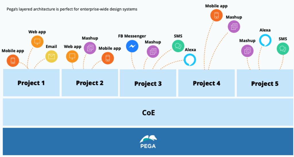
The Center of Excellence layer
Use a Center of Excellence (COE) layer that implements your design system. Inheriting UI elements from the COE layer increases both maintainability of the product and updates to specific UI elements. As a best practice, use out-of-the-box components and reduce customizations to create a COE layer with reusable components. In the COE layer, you can implement all the elements of your design system, such as web fonts, icons, and design templates.
Depending on the depth of your design system, you can decide whether to use the out-of-the-box COE layer or build your own layer.
Define branding and themes at the COE level, and then share them across multiple applications in the application portfolio. The following figure shows an example of the use of the COE layer across systems. Each project inherits and reused components from the COE layer. Then those components can be used across distinct channels.
Design tokens
The consistency of an application across platforms is critical. For example, match the primary button styling on mobile with the primary button styling on the desktop. To achieve consistency across platforms, quality design systems often employ design tokens, a strategy to design and store component styling aspects in one place and allow the system to automatically generate the platform-specific styling. The components in the Cosmos React library leverage design tokens.
For advanced use cases and more granular styling of specific Cosmos components, developers can modify the default values of each component's design tokens.
Note: For more information on design tokens, see Design tokens.
Check your knowledge with the following interaction:
This Topic is available in the following Module:
If you are having problems with your training, please review the Pega Academy Support FAQs.
Want to help us improve this content?