Building layouts in the section ruleform
Building the right section size
Avoid creating too many small sections and try to consolidate different layouts in a single section. This helps reduce the DOM size and improve overall page load time.
Choosing the right section size is a delicate balance:
- If the section is too large, the HTTP response on refresh will be larger and more elements will need to be refreshed
- If the section is too small, you will have to refresh several sections
There is no magic formula that works for all situations. Consider your requirements when creating layouts and keep in mind, many small sections will need many section refreshes, while one large section will take longer to refresh.
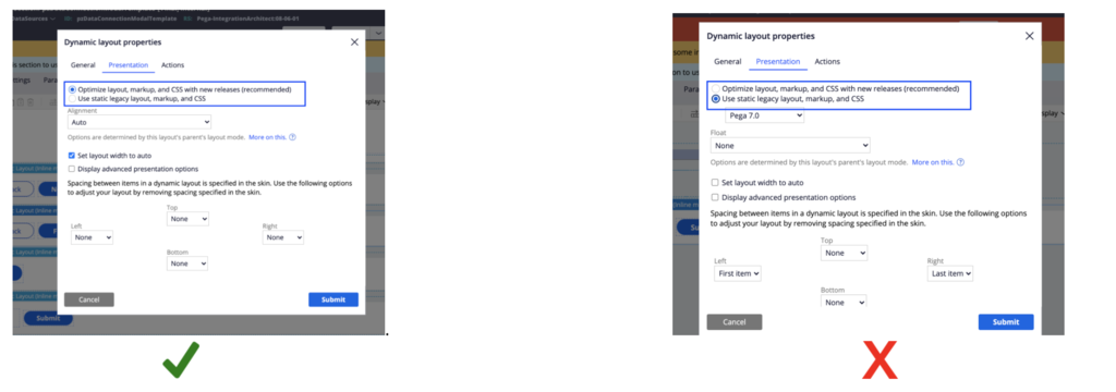
Using optimized dynamic layouts
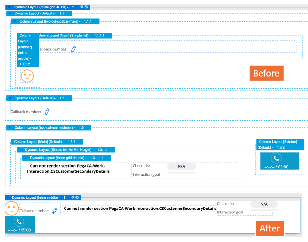
Optimized dynamic layout significantly reduces the DOM size and uses two <div> tags less than the non-optimized version. When editing a section, review all the dynamic layouts used in the section and convert them to use the optimized version.
Most of the out of the box helper classes will not work on legacy dynamic layouts. As such, it is important to convert all your dynamic layouts to optimize.
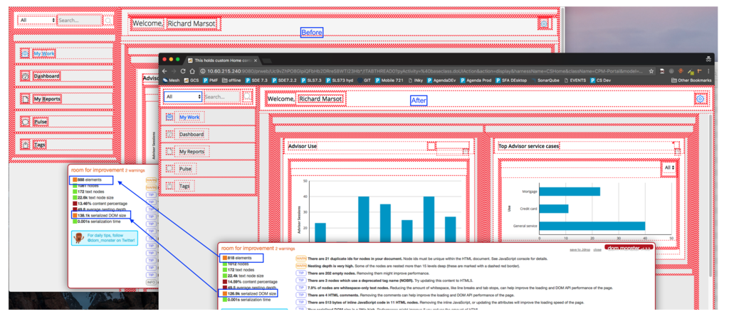
In the example below, the same application is shown through the DOM Monster extension before and after converting all the sections in UI-Kit to use optimized dynamic layouts. We can see a reduction of the elements in the DOM. The DOM Monster extension is a great way to review the UI elements that have a lot of nesting and could be optimized.
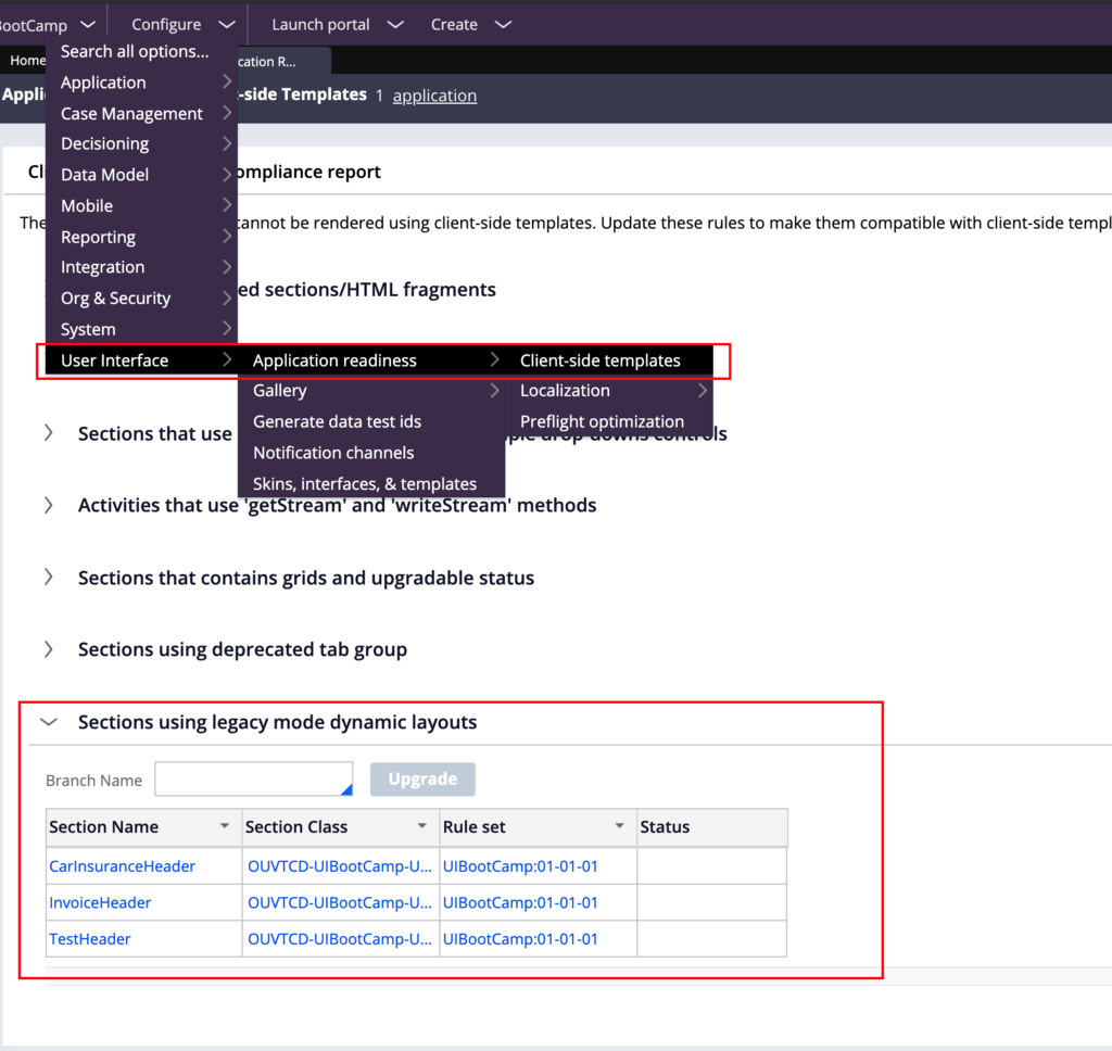
To automatically convert all your sections to use optimized layouts, open the landing page User Interface -> Application Readiness -> Client Side template. Expand the section named Sections using legacy mode dynamic layouts. The tool will list all the sections that should be upgraded. Enter a branch name and click on the upgrade button.
Optimizing the number of nested dynamic layouts
It is important to only add nested dynamic layouts when necessary. For example, there is no need to use a wrapper dynamic layout for adding a new header.
A typical mistake is to use three dynamic layouts to have buttons on the left and on the right. Using flexbox, only one dynamic layout is required. Use margin-l-auto on the first button that needs to be pushed to the right.
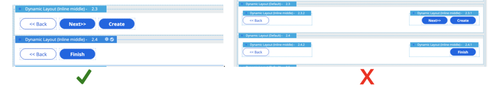
In the following example, the original section has 11 dynamic layouts that can be reduced to a single layout. The two sections provide the same level of functionality, but flex-based layouts are a better alternative to column layouts or inline grid double.
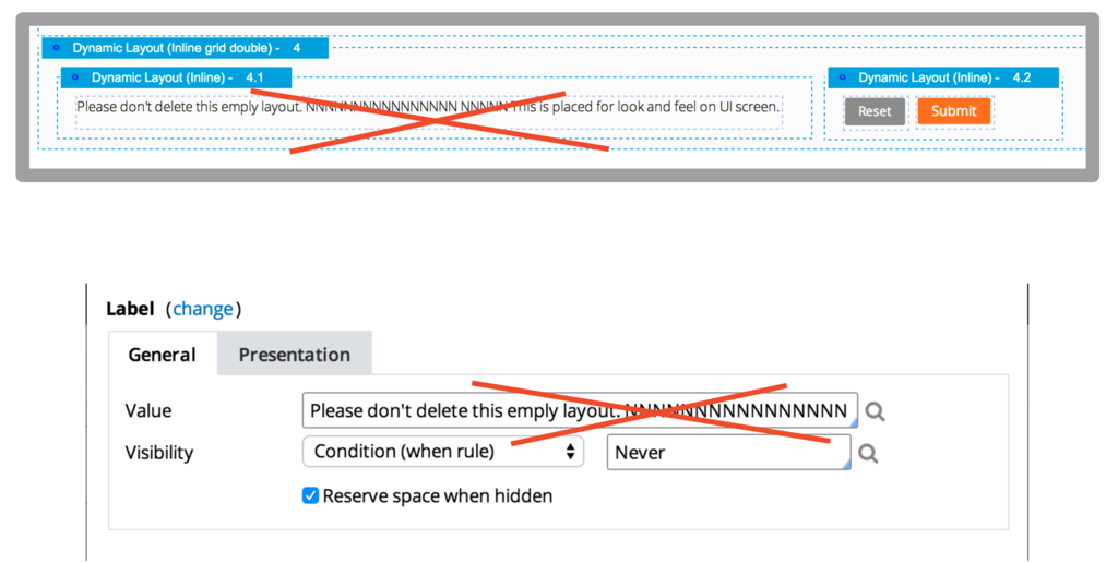
Avoiding layouts or labels as spacers
Avoid extra components for styling as this creates extra HTML nodes and affects performance. Instead, use layout formats or helper classes to achieve the expected design.
Using newer alternatives of components
When using some components, you need to use the newer alternatives.
|
Do not use |
Instead, use |
Why? |
|
Tabs |
Layout group (tab format) |
Smaller markup / small CSS selectors / Has all the features of tabs + more |
|
Column layout |
Dynamic layout inline middle |
Use flex-grow helper class on the main cell to fill the rest |
|
Grids when it is NOT a grid |
Repeating Dynamic Layout |
Smaller markup and CSS selectors |
|
Accordion |
Layout group (Accordion format) |
Accessible and responsive layouts |
|
Row repeat |
Repeating Dynamic Layout |
Responsive layouts |
|
Freeform or smart layouts |
Dynamic layouts |
Responsive layouts |
|
Legacy Table |
Use the ‘optimized’ table |
Smaller markup – more accessible |
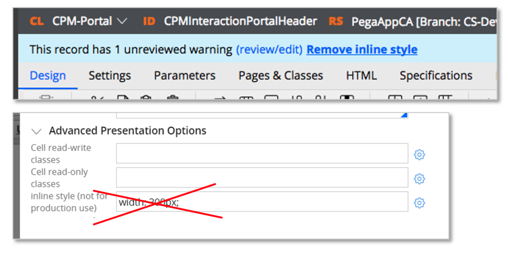
Avoiding inline style in the property panel
Inline styles set on a dynamic layout or cell are difficult to maintain and generate a guardrail warning. Use the correct format or helper classes.
Check your knowledge with the following interaction.
If you are having problems with your training, please review the Pega Academy Support FAQs.
Want to help us improve this content?