Controls and presentation
User interface elements
User interface elements, such as text inputs and layouts, present information and actionable items on the user interface.
Pega Platform™ UI elements include basic controls that can be used out of the box, such as:
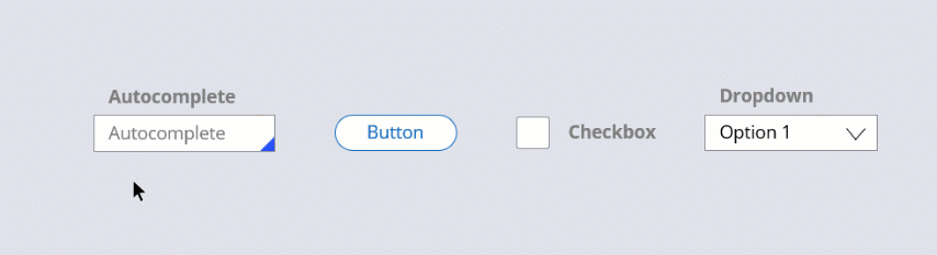
- Autocomplete controls
- Buttons
- Charts
- Check boxes
- Drop-down lists
- Links
- Sliders
- Rich-text editors
UI elements can be reused and customized as needed by applying existing styling to enable developers to manage controls and styling separately. Out-of-the-box UI elements, such as a basic button, come with predefined formats. The predefined formats for a button include Standard, Simple, and Strong.

You can style all presentation elements of your interface, including typography, borders, backgrounds, layouts, and UI placement and alignment. Using a predefined format applies a combination of those styling options. For example, you can apply a format that styles buttons to have a black border, white background, black font color, centered text, and centered alignment on the interface. Applying the format applies all the styling defined for that format. Formats for specific control types are reused across the application.

Styling for basic controls
Presentation and styling are defined for a specific control. Depending on the control type, you can style different aspects of the control. For example, unlike a text field, a link does not have a border, meaning you do not apply a border color to a link.
Some controls allow you to change the presentation of the label or caption. For example, you can add a button caption above a button or replace the button label with an icon, as shown in the following image.
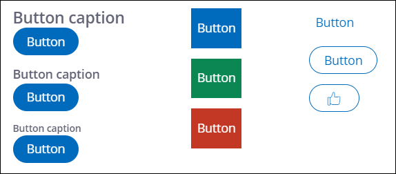
Establishing a consistent look for Button controls in your application saves development time, gives your application a more predictable user interface, and makes it easier for users to complete forms. Designate the format of the Button control to provide a visual cue to users about the button's relative importance. For example, for the Submit button on a form, set the Control format option to Strong as a cue to users that it is the primary action that they can take on the form.
In the following image, click the + icons to read more about some of the available basic controls.