

Exploring Fields
When first designing your application, plan your Data Model. A model-driven approach encourages you to define Data Objects, fields, and relationships early at both the application and Case Type levels. Fields model the data in your application and control what information is displayed to your users during Case processing.
Field settings
You define the presentation of your application's user interface (UI) by applying out-of-the-box fields and field settings. This prescribed approach to defining the fields and field settings simplifies user interface development by auto-generating Views based on the data structure. This allows the application development team to focus on designing the business logic instead of styling.
For example, in a process for hiring new employees, you can add fields that correspond with the personal details of a candidate, such as a name, surname, and an interview date. You define the respective field types as two Text fields and a Date field. When you display the fields in an editable View, the system automatically renders them as two text boxes and a calendar control. You can also set the Required status for each field to Always, ensuring the new employee provides the necessary information.
Pega Platform™ includes fields with predefined settings that you can apply to Views. These fields help you maintain consistency and reduce development time while you customize application logic. The basic field settings that are shared by most fields and should be considered when designing an application include:
- Field Type
- Field label settings
- Editing options or mode
- Additional text, such as placeholder and helper text
- Form messages, such as field warnings
- Field behavior, including required, disabled, and visibility statuses
Dynamic attributes for UI elements
Dynamic UI design is the practice of designing elements on a user interface to adapt according to user input. You configure when UI elements are visible, disabled, and required according to specified conditions to ensure that a user has all the information needed for their intent. For example, when submitting a loan request, customers specify their marital status. If customers select married, the application displays user entry fields for their spouse.
To design dynamic functionality for UI elements, you can design when elements are visible, disabled, and required.
Visible
Design the visibility of a field or layout to display the field or layout when a specific condition is satisfied.
The following table contains visibility setting options:
| Visibility setting | UI element behavior | Example | Sample description |
|---|---|---|---|
| Always | Always appears. By default, UI elements have a visibility setting of Always, meaning the UI element always appears on screen. |
|
You want the Name field, where application users enters their name, to be visible always. |
| Custom Condition | Appears when an expression, including When Rules, returns true. Use this option for short expressions that you do not need to reuse throughout your Case. |
|
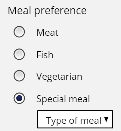
When users choose the Special meal option, they display the Type of meal drop-down list. Otherwise, the drop-down list does not appear. You determine that you need this expression only in this place. Consequently, it is appropriate to use the Custom Condition option. |
| When Rule | Appears if a When Rule returns true. Use this option for more complex When Rules or for When Rules that you reuse throughout the Case Type. |

|
You create a When Rule, for example, when the Marital Status = Married, which you plan to reuse. You reference this When Rule so that when the user selects Married as their Marital Status, the Name of Spouse field is visible. This field is not visible otherwise. |
| If not blank | Appears if the value of the field is not blank. |
|
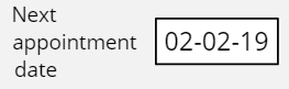
When confirming a doctor’s appointment, patients can optionally select a date for their next appointment. If patients select a date, the Next appointment date field is visible. If the patient does not select a date, the Next appointment date field is hidden. |
| If not zero | Appears if the value of the field is not zero. |

|
When customers make an online purchase, their order total is calculated. If the Order total field is greater than zero, then the value displays. If the calculated order total is zero, then Order total is hidden. |
Disabled
Design when a field or layout is disabled to limit user access to a field. A field or layout is disabled when a specific condition is satisfied through user action.
The following table displays options for disabling UI elements:
| Disable setting | UI element behavior | Example | Example description |
|---|---|---|---|
| Never | Never disabled. By default, UI elements are never disabled. Users always have access to the UI elements. |
|
You want a user always to be able to enter their name in the Name field. |
| Always | Always disabled. |
|
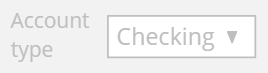
A customer chooses the type of account when opening a bank account. After creating the account, the customer can see, but not modify, the account type. You configure the Account type field always to be disabled to achieve this behavior. |
| Custom Condition | Disabled when an expression, including When Rules, returns true. |
|
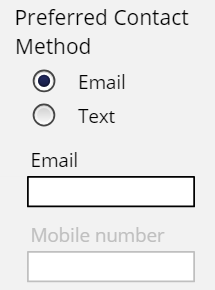
If users select Email as their Preferred Contact Method, the Mobile number field is disabled. If users select Text as their Preferred Contact Method, the Email field is disabled. You determine that you need this expression in only this only place. Therefore, it is appropriate to use the Custom Condition option. |
| When Rule | Disabled if a When Rule returns true. |
|
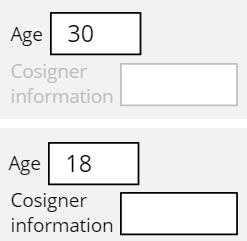
You reference a When Rule, when age is 21 or older, to ensure that when a customer applies for a credit card, if the customer is 21 years of age or older, the Cosigner information field is disabled. |
Required
Design when a field or layout is required to ensure that a user specifies a value. A field or layout is required when a specific condition is satisfied.
The following table displays options for making UI elements required:
| Required setting | UI element behavior | Example | Example description |
|---|---|---|---|
| Never | Never required. By default, UI elements are never required, meaning the user can proceed with Case processing without specifying a value. |
|
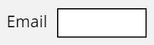
You want the Email field to be optional but not required for users. |
| Always | Always required. |
|
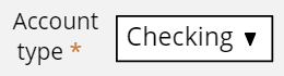
When customers open a bank account, they must choose the account type. The Account type field is always required. |
| Custom Condition | Required when an expression, including When Rules, returns true. |
|
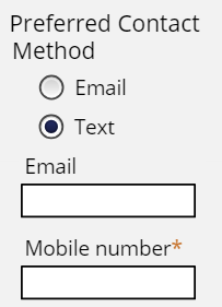
If the user selects Email as the Preferred Contact Method, the Email field is required. If the user selects Text as the Preferred Contact Method, the Mobile number field is required. You determine that you need this expression in only this place. Therefore, it is appropriate to use the Custom Condition option. |
| When Rule | Required if a When Rule returns true. |

|
You reference a When Rule, when the age is less than 21 to ensure that when a customer applies for a credit card, if the customer is younger than 21, the Cosigner information field is required. Otherwise, providing cosigner information is optional. |
Primary Fields
Define Primary Fields to automatically add the most relevant fields to your Cases and reduce the amount of UI configuration that is necessary. Primary Fields also ensure users are provided with the most relevant Case information to support faster Case resolution.
You can mark fields as Primary Fields in your Data Objects and Case Type Data Models to streamline UI configuration. Primary fields drive the UX, setting the default columns on embedded lists and Insights. The system also automatically adds these designated Primary Fields to the Create, Edit, Details, and List Views, so you do not need to add them to each View manually. This approach ensures consistent access to important information throughout the Case Lifecycle. The Case Type data model automatically designates the Label and Description fields as primary by default.
For example, in a Case Type that captures customer information, you define the Name, Email, and Address fields as Primary Fields. Then, you access the Address Data Object and define its Primary Fields, such as Street, City, and Country. The system then automatically adds the Primary Fields to the Create View.
Field Groups
When refining Views in Pega Platform, you can group individual fields in clusters to visually present related data together. Field groups help you organize your fields under a single header, and provide you with tools to add instructions or temporarily hide the fields in collapsible sections.
At run time, the system displays fields in a field group with a vertical line on the left. This visual cue helps users distinguish grouped fields from standalone fields. The following image shows a sample field group called Main info:

Check your knowledge with the following interaction:
This Topic is available in the following Module:
If you are having problems with your training, please review the Pega Academy Support FAQs.
Want to help us improve this content?