
Flexbox capability
Flexbox is a layout system in CSS that describes the positioning of child elements (flex items) relative to the parent (flex container).
A layout flows in one direction (row versus column). You can align items from the start or end of an axis or center the items.
You can also “flex” items in relation to one another in the space that is available by using properties such as flex-grow, flex-shrink, and flex-basis.
Note: IE11 browser does not completely implement the flexbox specification and some configurations might not render exactly as modern browsers.
Settings available on the flex container
The following list identifies the most important settings available to configure flex container properties:
- Flex-direction
- Flex-wrap
- Justify-content
- Align-items
Note: Only the flex-direction is configurable directly through the property panel - the other flexbox settings can be configured using helper classes or the correct dynamic layout format.
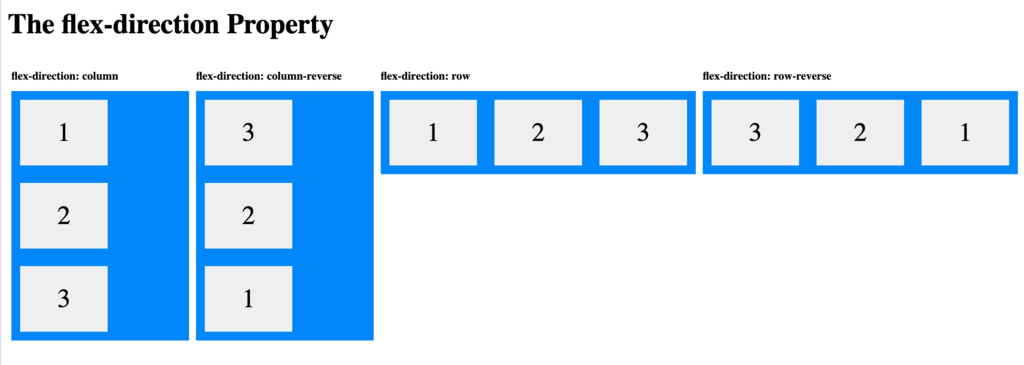
The flex-direction property defines in which direction the container displays the items. The property supports four values: row, row-reverse, column, and column-reverse.
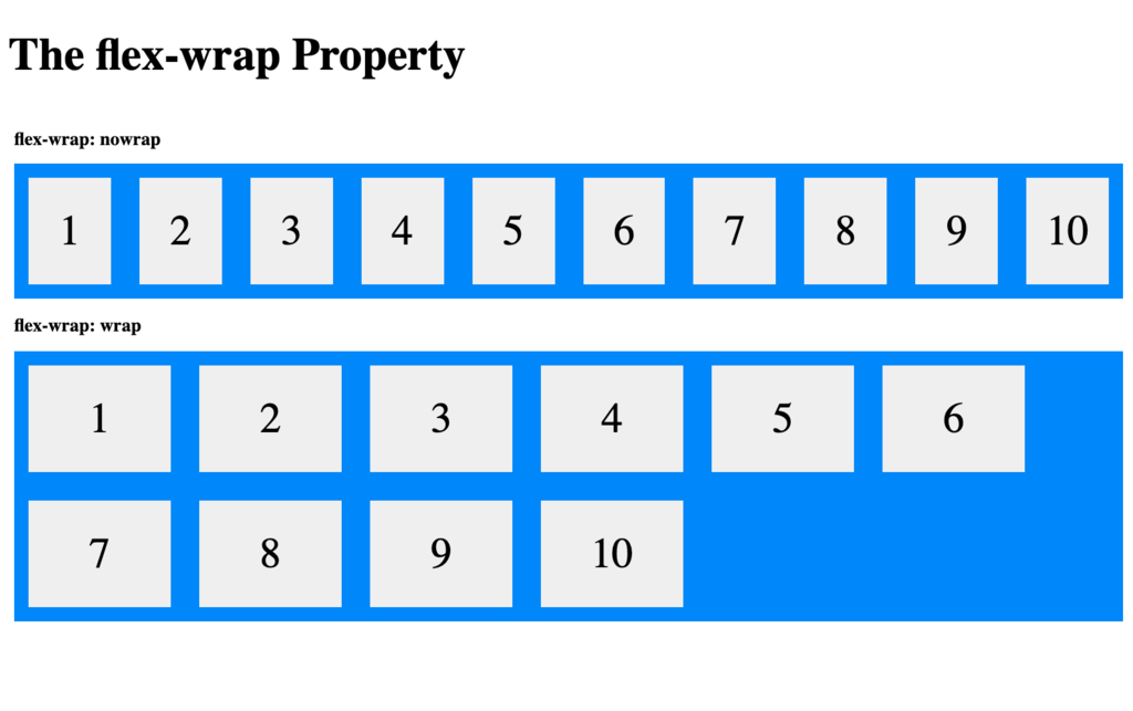
The flex-wrap property specifies whether the flex items should wrap or not. It supports two values: wrap and nowrap.
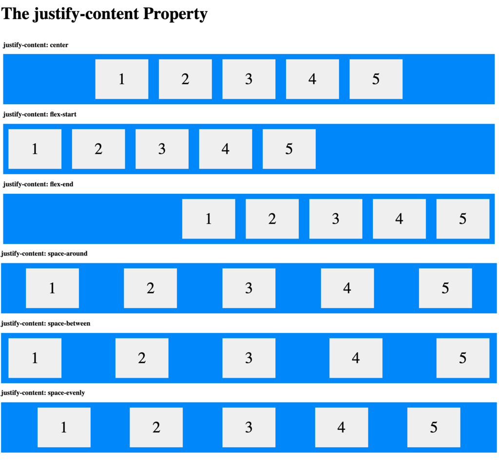
The justify-content property is used to align the flex items in the direction of the flex container.
For example, if the flex container direction is a row, setting the value of the justify-content property affects the positions of all the elements on the row, as shown in the following image.
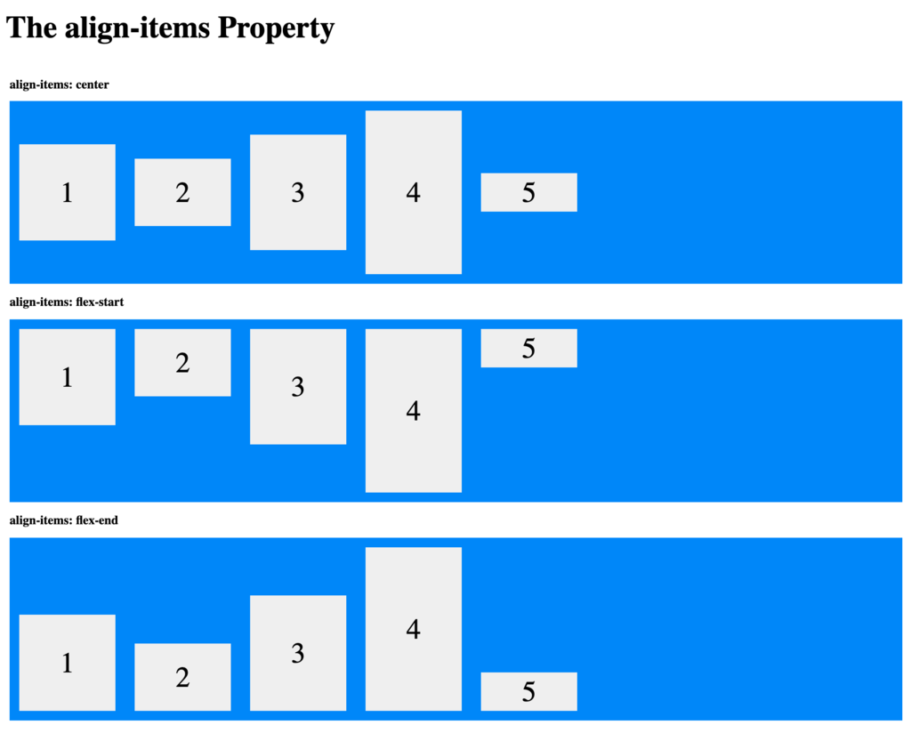
The align-items property is used to align the flex items in the opposite axis (also called the cross axis) of the container.
For example, if the flex container direction is a row, setting the value of the align-items property affects how the elements are positioned vertically inside the flex layout, as shown in the following image.
Settings available on the elements inside the flex container
The following list identifies the most important settings available to configure the items inside flex container properties:
- Order
- Flex-grow
Note: These settings can be configured using helper classes.
The order property specifies the order of the flex items. The first flex item in the code does not have to display as the first item in the layout. The order value must be a number. The default value is 0.

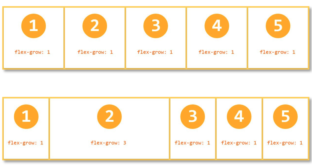
The flex-grow property specifies how much a flex item grows relative to the rest of the flex items. The value must be a number. The default value is 0.

Setting flex-grow:1 on all the items allows all the items to expand to the same size. You can then increase flex-grow for some items to give them more space.
Check your knowledge with the following interaction.
If you are having problems with your training, please review the Pega Academy Support FAQs.
Want to help us improve this content?