Applying a style to a UI element
Archived
2 Tasks
5 mins
Beginner
User Experience
English
Scenario
The UI team at GoGoRoads has asked you to style drop-down controls to simplify the drop-down list's appearance.
The following table provides the credentials you need to complete the challenge.
| Role | Operator ID | Password |
|---|---|---|
| Application Developer | author@gogoroad | pega123! |
Challenge Walkthrough
Detailed Tasks
1 Modify the style of the drop-down list on the Create view
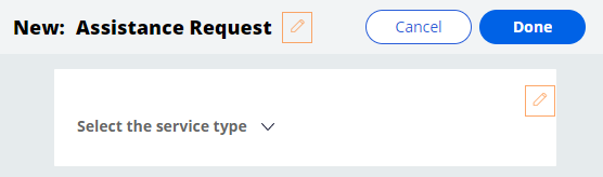
- In App Studio, create an Assistance Request case instance.
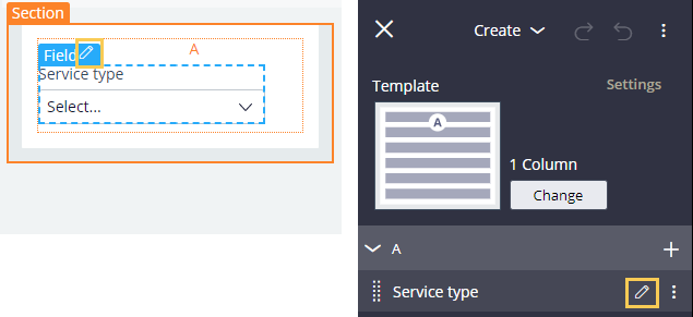
- On the Create view, click the Edit icon to edit the view.
- In the view, or in the properties pane on the right, hover over the Service type field and click the Edit this field icon.
- In the properties pane on the right, in the General tab, clear the Use property default check box.
- Clear the text in the Label value field.
- In the Placeholder field, enter "Select the service type".

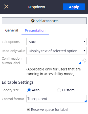
- Click the Presentation tab.
- In the Control format field, enter or select Transparent.
- In the area, click Auto.
2 Confirm your work
- In the header of the pane, click Apply to apply the presentation changes.
- Close the pane to return to the run-time view of the Create view.