Responsive user interface
Responsive behavior
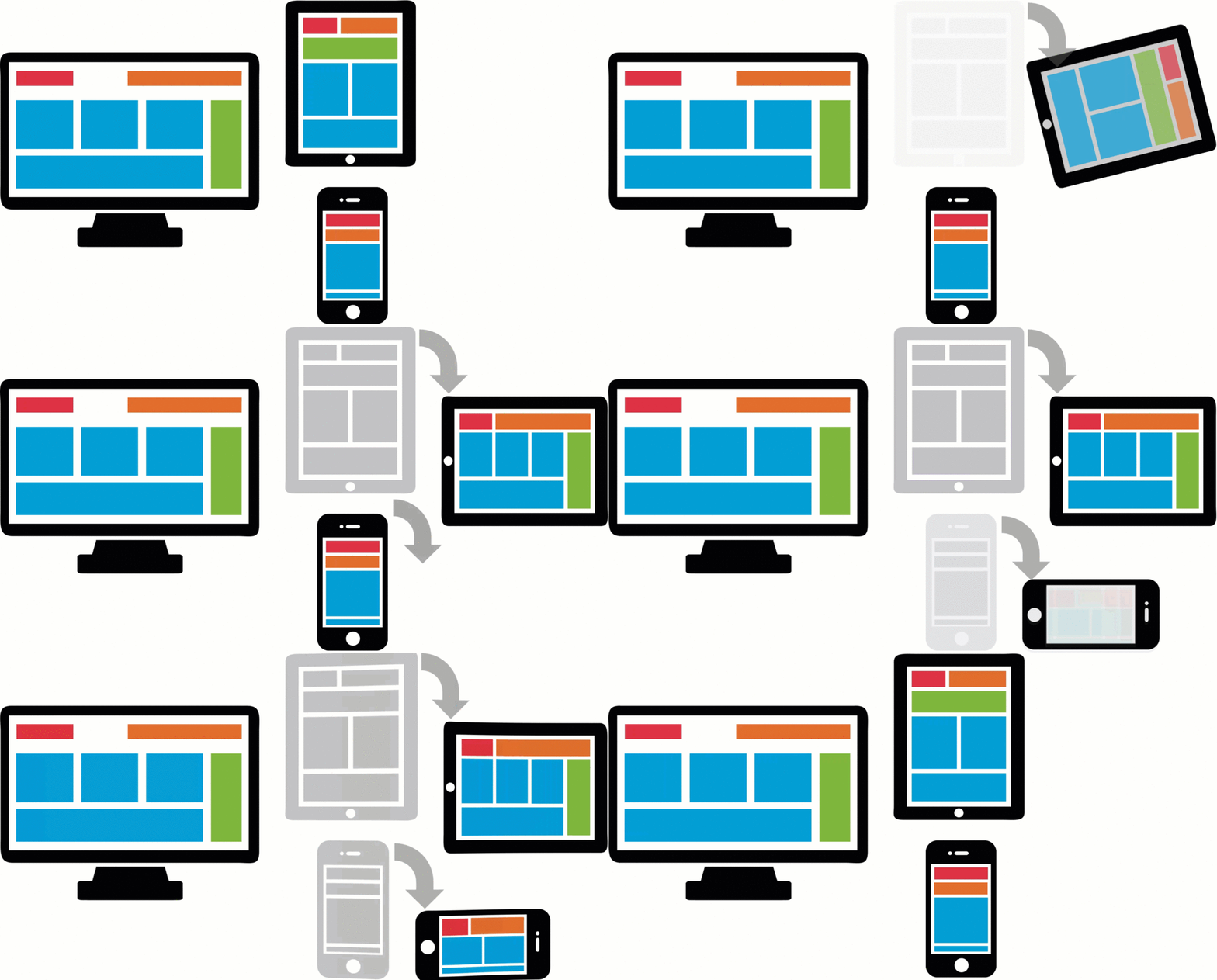
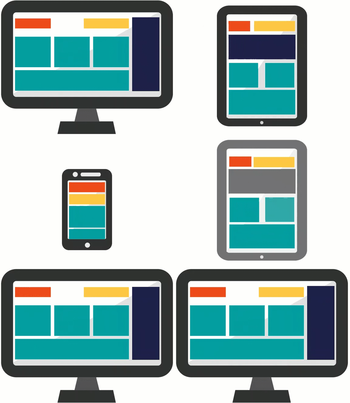
Responsive behavior provides an optimal user experience of the elements in a view regardless of screen size — minimizing horizontal scrolling and maximizing data presentation in the available display space. For example, when a user switches from landscape to portrait on a tablet, the UI responds and the screen dynamically becomes narrower.
Responsive behavior options include the design layout of the form and the column importance in tables.
Tip: Advanced customizations to responsive behavior, such as configuring custom breakpoints and modifying column importance, are performed in Dev Studio.
Responsive breakpoints
A breakpoint defines a display width. Pega responsive breakpoints are set automatically by default. When the display width crosses a breakpoint, the responsive behavior is applied to the layout. With a dynamic layout, responsive breakpoint behavior changes the layout of the fields based on the width of the display area.
For example, the default breakpoints automatically display four columns as two columns on a tablet, and as a single column on a mobile phone — making the form readable on smaller screen widths and eliminating the need for horizontal scrolling.
Layout templates
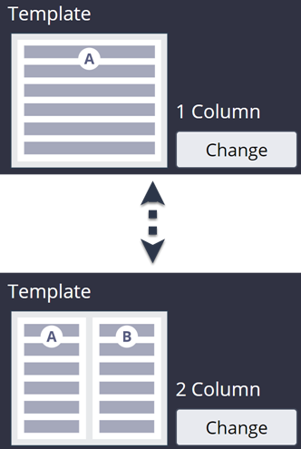
In App Studio, the layout of the fields is limited to the available design templates. The design template determines how the user interface changes. You can change the layout template by configuring the view at run time.
For example, you can configure a view to use a 2 column design template instead of a 1 column design template.
Check your knowledge with the following interaction.
If you are having problems with your training, please review the Pega Academy Support FAQs.
Want to help us improve this content?


