UI configuration in Constellation
The UI configuration model for Pega applications focuses on capturing business intent in the workflow and interpreting that intent across multiple digital channels. As front-end technologies evolve faster than before, interface architectures evolve as well. In the section-based architecture in Pega Infinity™ releases earlier than 8.7, developers built the application interface with section rules, dynamic layouts, skin formats, custom controls, and various property panel configurations. The new Constellation UI model provides more flexibility, which gives developers the means to more efficiently connect front-end components with back-end APIs.
The UI layer in the Constellation architecture subscribes to the Principle of Separation of Concerns, which is the software design principle that encourages software modularity by stipulating that an application should be divided into distinct sections, where each section addresses a specific concern.
UI elements
The Constellation architecture addresses the unnecessary complexity and inconsistent UI with a new UI model that you can use to author your applications with views, templates, and widgets.
In the following image, click the + icons to learn more about UI elements:
Automatically-generated views
For new applications that you build on the Constellation architecture with the Constellation library, the system automatically generates a set of views that you can use to instantly start configuring UI with App Studio.
Full case view
The Full case view represents a single case in Pega Platform™. Optimized for almost any case or business object, the three-panel layout accommodates a lot of information, much of which is available without scrolling or moving to other views.
In the following image, click the + icons to learn more about how you can configure the case UI in App Studio:
Note: In the above example image, the Preview section displays case values for each field, such as Primary Provider. In App Studio, the Preview section only displays placeholder text. To preview the case UI with data, run a case instance.
Summary data
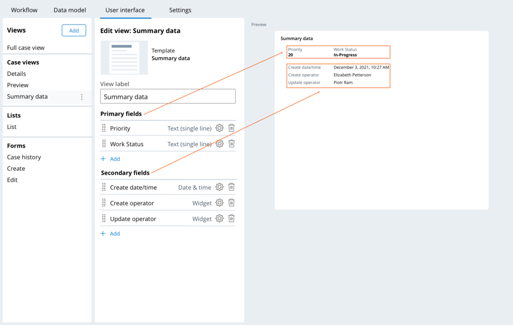
You configure the Summary data view to display the most critical data that users should understand as soon as they open the case. The fields that you map into the Primary fields region render inline from left to right, and their values render with a pronounced visual treatment. The fields that you map into the Secondary fields region stack vertically along the summary panel with the field label on the left and the value on the right.
Details
The Details view is a default, optional view that can render read-only case data, such as important fields, and other information. By default, the Details view is empty.
Pulse
The Pulse view is a default, optional view that displays Pulse, which allows users to post, view, and reply to messages in the context of this case.
Note: For more information about using the Pulse, see Preparing for collaboration with users by using Pulse and Collaborating with users by using Pulse.
Edit
The Edit view renders a form when users click Edit. The view includes important fields to edit at any stage of the case.
Create
The Create view renders a form to capture the data that is necessary to create the case.
List
The List view provides controls to efficiently configure a list of cases of this case type with various behaviors. The default configuration is a list that contains all open cases, but you can also configure the following settings:
- Displaying lists as tables or tile-based galleries
- Configuring different views of the list that users can select
- Selecting the columns to display in the list
- Filtering, sorting, and grouping cases and data references by criteria
- Performing bulk case actions on cases in the list
- Editing or adding new records to cases in the list
Check your knowledge with the following interaction:
This Topic is available in the following Module:
If you are having problems with your training, please review the Pega Academy Support FAQs.
Want to help us improve this content?
