Visualizing data in Constellation
Explore Data uses a view-based landing page and is the preferred data exploration tool for applications that use the Constellation design system. With the Explore Data landing page, you can explore and analyze your application data quickly. Query your data, and then sort, filter, and group the results based on your business requirements. For example, with the Explore Data landing page, you can access the list of assignments that are routed to members of your team. You can then drill down and analyze the assignment statuses to determine the remaining workload for the current release. You can save queries that you make on the Explore Data landing page as insights.
Insights
Insights are rules that Pega Platform™ uses to transform data queries into tables or visualizations that you can then share between users. You can use insights to retrieve specific data and present the data as a list or an interactive chart. For example, in an insurance application, you can visualize data for claims that are pending approval, and then analyze the type of claim and the amount submitted by users.
Layout of the Explore Data landing page
The Explore Data landing page displays a list of previously-created insights; you can view or edit an insight or create a new insight.
In the following image, click the + icons to learn more about the actions that you can perform on the Explore Data landing page:
Table-based insights
On the Explore Data landing page, you can display your custom data query in a table by using a table-based insight. Create a table-based insight or select a previously-created table-based insight to view or modify.
In the following image, click the + icons to learn more about the actions you can perform on a table-based insight:
Chart-based insights
On the Explore Data landing page, you can visualize your custom data query in a chart by using a chart-based insight. Create a chart-based insight or select a previously-created chart-based insight to view or modify.
In the following image, click the + icons to learn more about the actions you can perform on a chart-based insight:
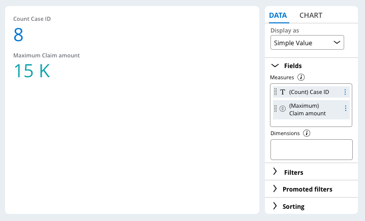
Simple value charts
A simple value chart is a high-level summary of data. To configure a simple value chart, in the Fields section, select fields in the Measures area only. The Display as list then updates to include the Simple Value option.
The following figure displays a simple value chart with the count of Case IDs and the maximum claim amount:
For a simple value chart, you can customize the layout of values. In the Layout list, choose from the following options:
- Highlight to display the values of all data series.
- Highlight + summary to display the value of one data series only and include other data below that series.
- Custom highlight + summary to create a custom layout.
The following figure displays the Chart tab for a simple value chart:
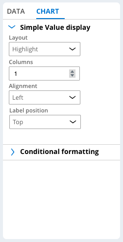
Depending on the layout that you select, you can customize specific arrangement settings. You can also add conditional formatting for a simple value chart.
Check your knowledge with the following interaction:
This Topic is available in the following Module:
If you are having problems with your training, please review the Pega Academy Support FAQs.
Want to help us improve this content?